It would appear that the combination of both my ancillary texts and my product have a very strong link to each other. Whilst producing my ancillarys i made sure that all of them complied and related very well to my groups trailer. This was so that all 3 would be easily recognisable and relatable even if you are not viewing all three items at once.
Most of my fellow classmates chose to use a casual image of their main character for their magazine, wearing plain clothing. However i wanted it to be able to strongly relate to my film and therefore i chose to use an image of Josh Farrant in a Santa Suit in which he wears in the film, I felt that this would make it easier for the audience to recognise who he is and which film he is starring in. As he is smiling and dancing in it, therefore I felt that this would appeal to both our target audience and comedy lovers. It appears lighthearted and shows of some sort of sense of humor, which may not appear in the film. Therefore making the audience be able to relate to Josh as a real person and not just an actor in a film. I followed a colour scheme with my text which consisted of colours found in his outfit, this was to make sure that my poster looked professional and did not clash.
This is my film poster, I used the clone stamp in order to clone images of a females face to place all over the background, not only did this make it appear creepy and as though there were faces in the wall, but also she does not feature in the trailer which gives a sense of mystery as you do not know who she is. I used an image which was shot from below which gives the main character a dominating feel, making the audience, in turn, fear him. You are not able to see his eyes and therefore are not able to make out properly what he looks like, which makes you not be able to form a friendly relationship with him. He looks daunting and emotionaless as is face and body is positioned in a deadpan stance making it appear as though he has no emotion. I used scratched out and faded writing in order to give some sense of decay to my image which seems to relate to the majority of horrors as a lot of things are run down and not looked after. I made sure that I used a very plain colour scheme in order to make the main character really stand out and 'pop'. This would draw the attention to him. I also followed this colour scheme through onto the text by using the mustard yellow from his belt on a previously directed film called 'Interrogation'. and the reds from his suit on the names of people for example; Directors and Producers.
The film trailer works well with both the Magazine and the film poster as you can tell that they are all related to eachother, i think i made a good descision with using similar images for my two ancillary texts and my trailer as you able to easily distinguish that it is the same film.
Wednesday, 2 May 2012
What have you learnt from your audience feedback?
I found that the Audience feedback really helped me when it came to refining my work, it made me take my work and look at it from an outside perspective. I made sure that I asked extremely honest people as I wanted to recieve constructive critisism so that i would be able to improve the products in which i had produced.
My film magazine I asked A fellow student 'Laura Sanderson' to critise my work so that i would be able to improve it. I filmed her talking about my work so that i would have a filmed documented piece of work. These will be uploaded on a seperate post above.
I also asked a selection of 25 adults what colour scheme they thought would fit a horror film the best (poster wise)
Black and White 1
Black and Red 12
Green and Red 2
Purple and Black 4
Purple and Red 5
Other 0
I therefore took into consideration the research in which i gained from an audience and decided to edit my poster into a black and red colour scheme.
After creating a few mock ups of both of my poster and asking people their opinions, it made me realise that my own personal thoughts on the products were no longer important, instead i had to start worrying about what other people thought as thats what really matters. I assumed that both males and females would have had a different take and ideas on how i should present my work, however i was extremely wrong and it appeared that both males and females had the same ideas as to how products relating to horror films should look and appear.
Joe Dodds: It is a very original topic and concept, I really enjoyed watching the trailer and felt that both of your products suited your work very well. The way in which you presented the trailer, particularly the darkroom scenes, i thought was very impressive as not many people use that idea in films, therefore this makes it stand out from others and attract a larger audience. I would definitely watch this if the film was ever to be produced. However some of the footage could be a bit bright so that you are able to see all of the surroundings.
My reply: The comment on the brighter footage does not really apply to my footage as we were following the standard codes and conventions of a horror film.
Tuesday, 1 May 2012
In what ways does your media product use, develop or challenge forms and conventions of real media products?
In what ways does your media product use, develop or challenge forms
and conventions of real media products?
My group product was based on a christmas horror, and therefore when creating the products I had to keep in mind that the concept and theme of the work I produced had to appear creepy and eery. I analysed different posters, magazines and trailers in order to be able to easily recognise how the codes and conventions of each are put into place, this made my editing process a lot easier for me.
I produced a film trailer with my group, and individually produced a film poster and a magazine cover.
 A Masthead: A masthead is the title of the magazine which lets the readers know what exactly they are reading
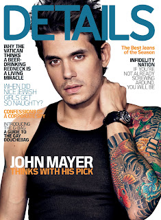 Main Image: This typically consists of models, musicians or actors, therefore I shall be using an image of our main character of the film. Instead of using a serious image shot like I did for the poster, I shall be using a more light hearted image in order to show the personality of the actor, which therefore will make the magazine appear more personal and friendly. I wanted to portray that the actor was not evil in real life, and therefore chose an image of Josh smiling and dancing.
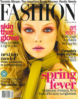 Tag: This is one word or a phrase which is used in order to engage the reader and draw them in to reading your magazine for example ‘Exclusive’, ‘Sensational’, this showing that the magazine has high compliments.
I used the word 'Exclusive' As it puts across the impression that that would be the only magazine featuring that particular content in it, and therefore that would be a good selling point as no other magazine would be featuring the content.
Coverlines: These are essential articles which are featured inside the magazine, they are usually shown along the left hand side of the magazine, therefore i used this placement in order to comply with the codes and conventions of the magazine. As my magazine is a film magazine I decided that my cover line would be 'The Top 10 Films of 2012' therefore this would be an up to date article which would enable readers to see what the best up and coming films are, I also used an image of 'The Hobbit' as it would make the audience interract with the article with more ease.
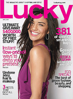 I made sure that a lot of my fonts were in different sizes in order to draw attention to the headings, which would then make the reader look at the additional information below. I also made sure that I used bright colours for the font which also fitted in with the colour scheme of the image, therefore this made my magazine not look trashy and randomly collated. By using a colour scheme it gave my magazine a smart and sophisticated look. Before starting to create my magazine cover I carried out research into the standard magazine sizes and from there decided that I would use an 8x11 inch magazine cover, this was so that I fitted the codes and conventions of magazine covers and therefore it would not look unusual or out of place. At the bottom of my magazine I used a font made out of film strips, I done this as i thought that it fitted in well with the concept of my magazine and also made it more interesting to look at, this font i found on a website called 'dafont' which was free. This meant that i did not have to spend any money creating my magazine as i was able to collacte all of the resources for free which i needed to use. All in all i think that my magazine was particularly successful, it was a fast and easy process which I had previously gained the skills required to carry this task out both quickly and efficiently as I had already made a mock of a film poster.
 At the top of the poster I used font in which I again found on 'DAFONT' which says"You Better Watch out" as this is the title of the film, and by using it in a larger font it would make it blatently obvious as to what the film was. I chose to use a deadpan image which i took of josh in the photography studio.
At the bottom of the poster I included additional information such as directors/producers etc, however as there was only 3 of us in our group I had to improvise and make up names in order to make it appear less tedious, I used a condensed text in order to fit the codes and conventions.
It was easy to distinguish the codes and conventions of horror film posters, they typically are formed with dark colours, for example; reds, blacks, dark greens and purples. As my trailer was for a christmas film I decided to go with a red and black colour scheme in order to give off an eery look. Instead of using a bright red, i experimented until i found a red that fitted into the concept which I had, which turned out to be a blood red colour, similar to most horror films. I edited my film poster on a mac, and therefore whilst editing I made it appear exactly how i liked, however when viewing it on a normal windows computer, the poster appeared different and seemed to lack professionalism.
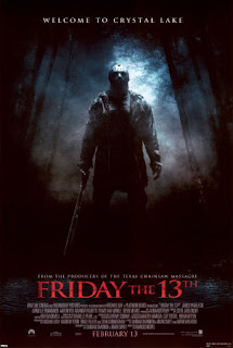
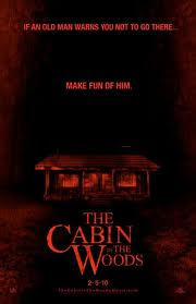
I also used a tag line in order to emphasize the film, I got this idea from both 'Cabin In The Woods' and 'Friday the 13th' as they have tag lines on their posters which say 'If An Old Man Warns You Not To Go There... MAKE FUN OF HIM' AND 'Welcome to the Crystal Maze' Therefore i came up with a tag line for my poster which was 'You wont sleep this christmas'.
Instead of going for a portrait layout i went for a landscape as i wanted it to be able to fit on billboards as opposed to signs at a bustation, and therefore used 1500x1500 pixels for my dimension. I chose to use a daunting image of our actor to enable the thoughts of the audience to be of fear.
I made a first draft of my poster and got some audience feedback from members of my class including things they liked and things that I could change, this meant that i was able to refine my work and therefore make it look more professional.
EDITING OUR FOOTAGE
I was not confident at all when editing the image, however luckily a member of our group, Josh Farrant was able to very easily edit our footage and teach and help myself along the way. Although I found it hard to pick up, I now feel a lot more confident using the editing software.
I was filmed as a character in the footage, so therefore i did not play a massive part in the filming side of things, however i feel that i have good skills when it comes to filming as i have had previous experience with using moving image during last years project and in my own personal time.
Whilst filming my group made sure that we had a lot of cuts of the same thing so that we knew we had good footage, this made it a lot easier for us when it came to selecting our scenes as we did not have to worry that we would be lacking any parts of it as we made sure that by refilming certain scenes that we had all of the footage in which we needed.
Filming in the photography darkroom posed a problem as the lighting made it difficult to see the footage, therefore throughout filming we had to change the lighting positioning in order to make sure that our footage was visable and not hard to make out.
My group product was based on a christmas horror, and therefore when creating the products I had to keep in mind that the concept and theme of the work I produced had to appear creepy and eery. I analysed different posters, magazines and trailers in order to be able to easily recognise how the codes and conventions of each are put into place, this made my editing process a lot easier for me.
I produced a film trailer with my group, and individually produced a film poster and a magazine cover.
The codes and conventions of a magazine cover are:
 A Masthead: A masthead is the title of the magazine which lets the readers know what exactly they are reading
I chose to call the magazine: EMPIRE FILM, in order to make it sound upper class and regal. I chose a suitable font which was easily readable so that it was obvious to the viewer what my magazine was called.
 Main Image: This typically consists of models, musicians or actors, therefore I shall be using an image of our main character of the film. Instead of using a serious image shot like I did for the poster, I shall be using a more light hearted image in order to show the personality of the actor, which therefore will make the magazine appear more personal and friendly. I wanted to portray that the actor was not evil in real life, and therefore chose an image of Josh smiling and dancing.
Strapline: Seen as an introductory headline below the main title (the masthead), to give an insight to the magazine.
For my strapline I took more of an advertising take on it "EXCLUSIVE: Interview with the star of 'You Better Watch Out' I used this as i felt as though it would draw in the audience if they were a fan of the film, it also highlights the main purpose of the edition of the magazine.
For my strapline I took more of an advertising take on it "EXCLUSIVE: Interview with the star of 'You Better Watch Out' I used this as i felt as though it would draw in the audience if they were a fan of the film, it also highlights the main purpose of the edition of the magazine.
Top and Bottom Strip: These are the strips below and above the magazine that give further information to what may be included in the magazine. Mostly being the interesting parts of the magazine. I chose to only use one strip at the bottom to make sure that i had enough room for more magazine content, i placed this strip at the bottom of my magazine in order todraw attention to it. I bordered this section with a mustard yellow colour, which I sampled from the bottom of Josh's belt colour. I done this as i wanted to make sure that my magazine followed a set colour scheme and therefore it fit into my magazines look.
 Tag: This is one word or a phrase which is used in order to engage the reader and draw them in to reading your magazine for example ‘Exclusive’, ‘Sensational’, this showing that the magazine has high compliments.
I used the word 'Exclusive' As it puts across the impression that that would be the only magazine featuring that particular content in it, and therefore that would be a good selling point as no other magazine would be featuring the content.
Coverlines: These are essential articles which are featured inside the magazine, they are usually shown along the left hand side of the magazine, therefore i used this placement in order to comply with the codes and conventions of the magazine. As my magazine is a film magazine I decided that my cover line would be 'The Top 10 Films of 2012' therefore this would be an up to date article which would enable readers to see what the best up and coming films are, I also used an image of 'The Hobbit' as it would make the audience interract with the article with more ease.
Barcode/Dateline & Price: A dateline in which the date of publish and the price are shown, the barcode is just the importance of the retailer. I created the barcode myself instead of getting one off of the interciew as i did not want it to match any other that could be found, i made the date line and price both small as I didnt want it to draw away the attention of the viewer, however i still made it visable as it is a vital piece of information.
 I made sure that a lot of my fonts were in different sizes in order to draw attention to the headings, which would then make the reader look at the additional information below. I also made sure that I used bright colours for the font which also fitted in with the colour scheme of the image, therefore this made my magazine not look trashy and randomly collated. By using a colour scheme it gave my magazine a smart and sophisticated look. Before starting to create my magazine cover I carried out research into the standard magazine sizes and from there decided that I would use an 8x11 inch magazine cover, this was so that I fitted the codes and conventions of magazine covers and therefore it would not look unusual or out of place. At the bottom of my magazine I used a font made out of film strips, I done this as i thought that it fitted in well with the concept of my magazine and also made it more interesting to look at, this font i found on a website called 'dafont' which was free. This meant that i did not have to spend any money creating my magazine as i was able to collacte all of the resources for free which i needed to use. All in all i think that my magazine was particularly successful, it was a fast and easy process which I had previously gained the skills required to carry this task out both quickly and efficiently as I had already made a mock of a film poster.
Poster Codes and Conventions

 At the top of the poster I used font in which I again found on 'DAFONT' which says"You Better Watch out" as this is the title of the film, and by using it in a larger font it would make it blatently obvious as to what the film was. I chose to use a deadpan image which i took of josh in the photography studio.
At the bottom of the poster I included additional information such as directors/producers etc, however as there was only 3 of us in our group I had to improvise and make up names in order to make it appear less tedious, I used a condensed text in order to fit the codes and conventions.
It was easy to distinguish the codes and conventions of horror film posters, they typically are formed with dark colours, for example; reds, blacks, dark greens and purples. As my trailer was for a christmas film I decided to go with a red and black colour scheme in order to give off an eery look. Instead of using a bright red, i experimented until i found a red that fitted into the concept which I had, which turned out to be a blood red colour, similar to most horror films. I edited my film poster on a mac, and therefore whilst editing I made it appear exactly how i liked, however when viewing it on a normal windows computer, the poster appeared different and seemed to lack professionalism.
I also used a tag line in order to emphasize the film, I got this idea from both 'Cabin In The Woods' and 'Friday the 13th' as they have tag lines on their posters which say 'If An Old Man Warns You Not To Go There... MAKE FUN OF HIM' AND 'Welcome to the Crystal Maze' Therefore i came up with a tag line for my poster which was 'You wont sleep this christmas'.
Instead of going for a portrait layout i went for a landscape as i wanted it to be able to fit on billboards as opposed to signs at a bustation, and therefore used 1500x1500 pixels for my dimension. I chose to use a daunting image of our actor to enable the thoughts of the audience to be of fear.
I made a first draft of my poster and got some audience feedback from members of my class including things they liked and things that I could change, this meant that i was able to refine my work and therefore make it look more professional.
EDITING OUR FOOTAGE
I was not confident at all when editing the image, however luckily a member of our group, Josh Farrant was able to very easily edit our footage and teach and help myself along the way. Although I found it hard to pick up, I now feel a lot more confident using the editing software.
I was filmed as a character in the footage, so therefore i did not play a massive part in the filming side of things, however i feel that i have good skills when it comes to filming as i have had previous experience with using moving image during last years project and in my own personal time.
Whilst filming my group made sure that we had a lot of cuts of the same thing so that we knew we had good footage, this made it a lot easier for us when it came to selecting our scenes as we did not have to worry that we would be lacking any parts of it as we made sure that by refilming certain scenes that we had all of the footage in which we needed.
Filming in the photography darkroom posed a problem as the lighting made it difficult to see the footage, therefore throughout filming we had to change the lighting positioning in order to make sure that our footage was visable and not hard to make out.
Subscribe to:
Comments (Atom)


