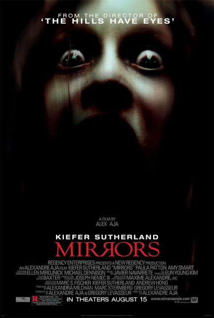
 The background of the image is black which already tells you that the film is going to be dark and spooky. Dark colours are used to express the unknown as you do not know what is exactly lurking in the dark. This would automatically make you feel fear towards the film.
The font of the main title ‘mirrors’ is in a blood red colour which is also a colour which is well known to relate to horror films as it represents the colour of blood. As the name of the film is ‘mirrors, the middle two R’s have been reflected against each other to have more effect on the audience, making it more memorable and enabling you to relate the title to the film more.
As the director of this film has already produced a successful horror film, ‘The hills have eyes’, at the top of the poster it states this. It had been positioned here so that it is not the initial part of the poster in which you automatically are drawn too, however the contrast in colour between the black background, and the white writing draws you to it. This helps the audience to define whether this film would appeal to them based on a previously made film by the same director. This film was chosen as it is a well known film, whereas if the director made a not so successful film, it would be less likely to be featured in this poster.
The main image is an image of a young girl, you are able to tell this as the skin that is lit up by a light shining from above shows no blemishes or wrinkles. The fact that it’s a young girl makes it more eery as the fact young girls are meant to be innocent and harmless, therefore this deviates from the social norm.
Smaller white writing is featured at the bottom of the poster crammed together, this is because less people would be interested in it, however it is still important enough to be featured.
No comments:
Post a Comment